That's right, I made this website! Click below to see more details.
For this frontend project, I utilized HTML and CSS to shape the design, ensuring a visually appealing and well-structured webpage. To add dynamism, I incorporated JavaScript, implementing interactive elements and responsive features. This combination of HTML, CSS, and JavaScript results in a website that not only looks modern and polished but also delivers a user-friendly and engaging experience.
The primary design tool employed for this website was Bootstrap, providing a foundation for page layouts and fundamental designs. Additionally, I integrated JQuery to facilitate transition animations requiring JavaScript, enhancing the overall visual appeal and user experience. Using both Bootstrap and JQuery ensures a streamlined design process and adds dynamic elements to the website seamlessly.
Visual Studio Code served as my primary development environment for crafting this website, offering a versatile platform for coding and project management. In tandem with this, Figma played a key role in the design phase, enabling the creation of comprehensive blueprints for the overall layout. The synergy between Visual Studio Code and Figma streamlined the development process, fostering a seamless transition from conceptualization to implementation.
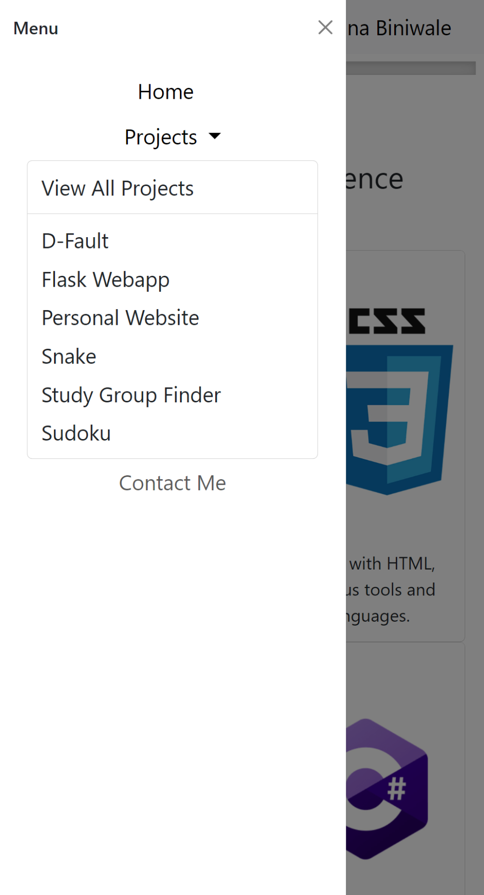
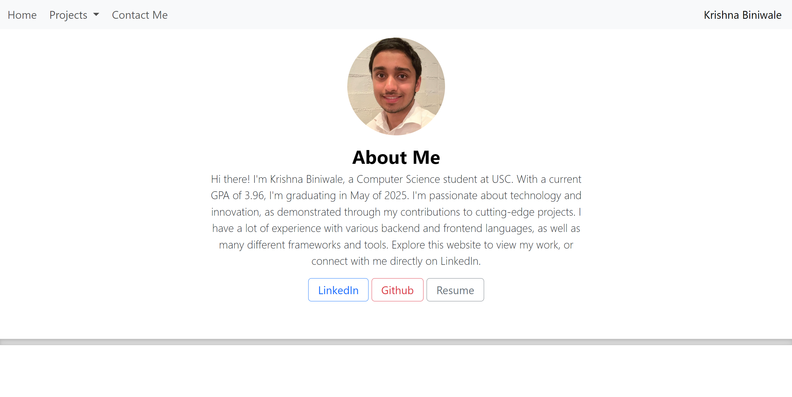
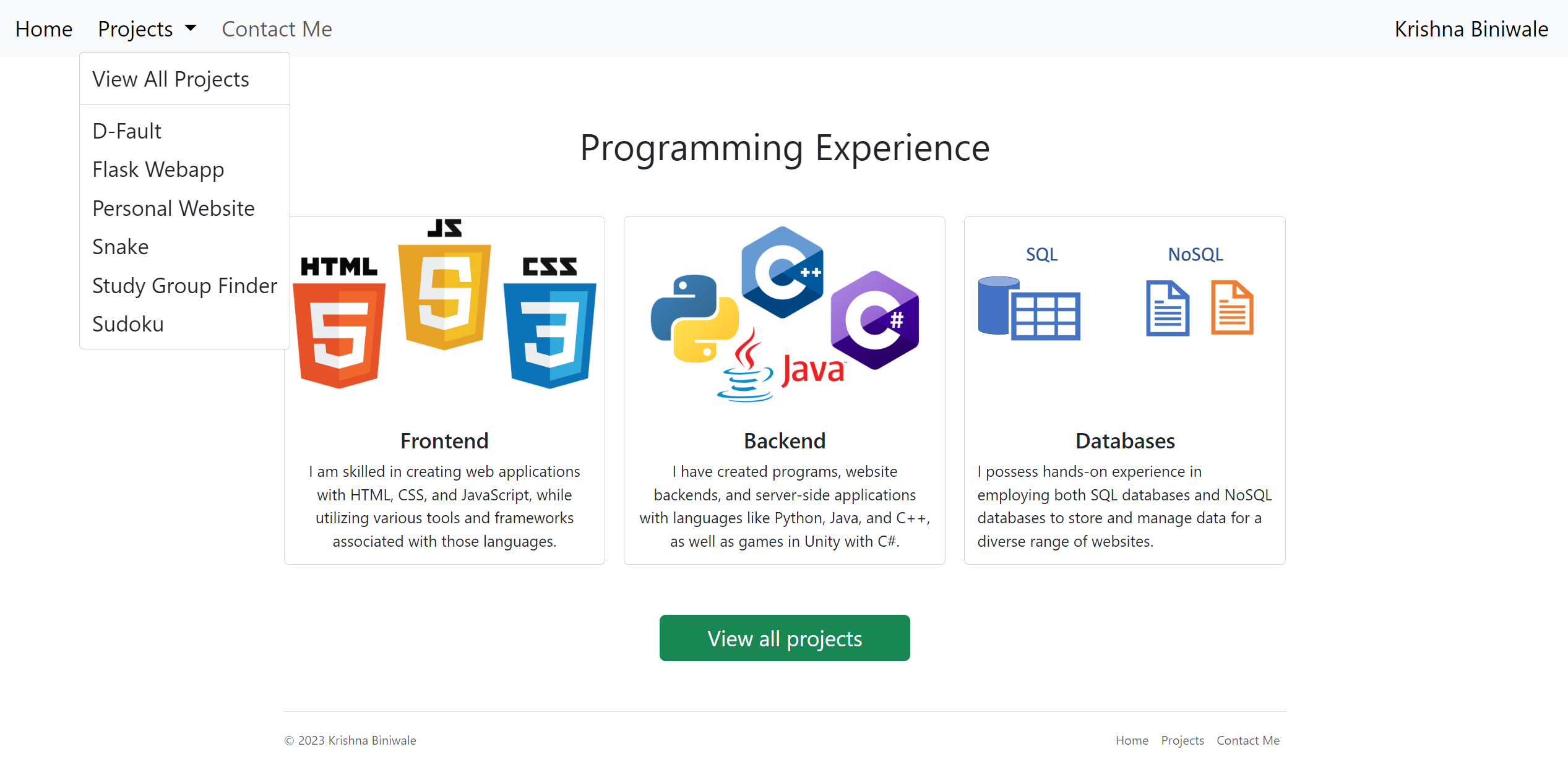
Fun fact: This website is 100% responsive! If you're on desktop, trying opening this on your mobile device and vice versa. You'll find that the website seamelssly adapts to different screen sizes to give you the most optimal experience!
This is how it looks on desktop.
While it looks like this on mobile.